Websites have moved on a bit since the first one went live back in August 6, 1991.
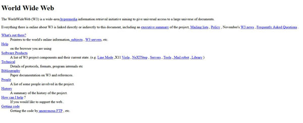
Can you imagine spending much time on a site that looked like this?

When Tim Berners-Lee put up the first webpage of the first ever website he didn’t really need to think about the layout. Firstly he’d done a pretty nifty job of creating the World Wide Web (kudos) and secondly, he didn’t have any competition.
There wasn’t another site out there telling people how to create websites and web pages. Tim didn’t need to worry about standing out; about which font to use or choosing the right image.
Imagine if things had never progressed, if people’s first website was their only website?
Websites of The Past
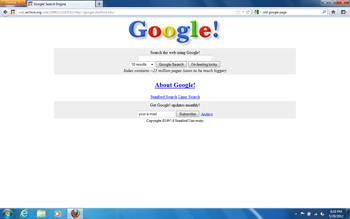
Google, notorious for keeping a similar style since its creation, would look updated with their very first search 1998 homepage.

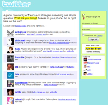
And Twitter would feel more like an outdated company intranet or dating site, rather than the cutting edge professional operation its site portrays today.

In the same way that fashion, food and music go through trends so does the web. While you don’t have to change your site at every fleeting fad, its important your site lives up to user’s expectations or they’ll be hoping over to other sites that do.
3 Web Design Trends That Are Worth Following in 2015
1. Mobile First
We all know websites need to be responsive, so the ever growing legion of mobile visitors can check out your site the way nature (and the web developer) intended.
Mobile traffic (smartphones, tablets etc.) accounts for about 30% of website page views. That’s 3 times as much as 2 years ago!
And if you look at time spent, rather than just page views, this report by comScore shows that mobile platforms account for 60% of digital media time spent.
If you’re one of the many designers and developers are still designing for large screen desktops, then here are some reasons it may be time to have a rethink:
– Mobile Users – as shown by the data above, more users are accessing your site from a mobile device. This means they care about the mobile experience more than the desktop one.
– Mobile Browsers Rock – well, they’re better than they use to be! Apart from the limitations of screen space and download bandwidths, mobile devices are almost at par with desktops.
– Desktop for creation. Mobile for consumption – Most users consume their content on mobile devices. That content is largely created on desktop, however many firms are starting to turn to mobile devices for work now as well.
With 20% less screen space available, mobile first forces you to focus on the content and user experience. This means leaner cleaner code, starting with only the bare essentials and adding what’s needed.
You still need to convey the message, just more succinctly.
2. User Experience (UX)
UX is the essence of the web, but for far too long people have focused on designing websites for machines rather than humans.
Being more focused on the site’s content is a great step, and huge developments in CSS mean it’s easier than ever to make cool stuff happen around that content.
We’ve moved on from sites where the only thing that changes as we interact with it is the colour of the link text.
Some UX Design Trends That Are Becoming Increasingly Popular
– Large Background Images –One of the simplest ways to make your site stand out is by having beautiful background images and videos displayed prominently.
– Ghost Buttons – Ghost buttons are minimal, stylish, and with subtle hover animation they’re a delight to use (and, coincidently, they go great with large background images and videos).
– Typography – Type kits are becoming more affordable (even free in the case of Google Fonts), allowing designers with smaller budgets more freedom with their typography skills.
‘Google is becoming more advanced and ultimately more human like with every update. So if you want to attract Google and keep in its good books don’t try and fool it, just give it what it wants…. A good user experience just like the rest of us.’ David Bee, Digital Creative Director at Mosaic Digital
3. Human Focused Content
We’ve seen a massive change in focus over the years when it comes to content. The days of stuffing text with so many keywords that it becomes unreadable are over (we tip our hats in thanks to Google’s Penguin and Panda).
Content needs to be human focused, and nothing is more human focused than getting your content to tell a story.
We’re not talking fairy tales or epic works of fiction, your brand narrative is made up of a series of concepts or values. It’s not just web copy; images, page layout and font choices are all tools which help convey your story.
Regularly updating your content, adding a blog or news page and integrating your social media are all must haves if you’re hoping to grow your community and improve your SEO. Fresh and unique content not only helps you make it up the Google rankings, it’s also a huge factor in how long people stay on your site and how often they revisit it!
Now it’s Your Turn
So if you haven’t updated your website in a few years you may be missing out on some awesome tools and methods to achieve better rankings, grow your community and ultimately increase sales. Make 2015 the year you crack your mobile friendly, user focused, storytelling website!
We’re shared our web design trends, we’d love to hear yours. Do you have any favourite sites that you just can’t stay away from? We’d love to hear, share them with us in the comments below or come over to Twitter and say hi!
